

MOCA Taipei Rebranding


MOCA Taipei Rebranding
Instructor: Robert Petrick · Designed in 2019 Fall
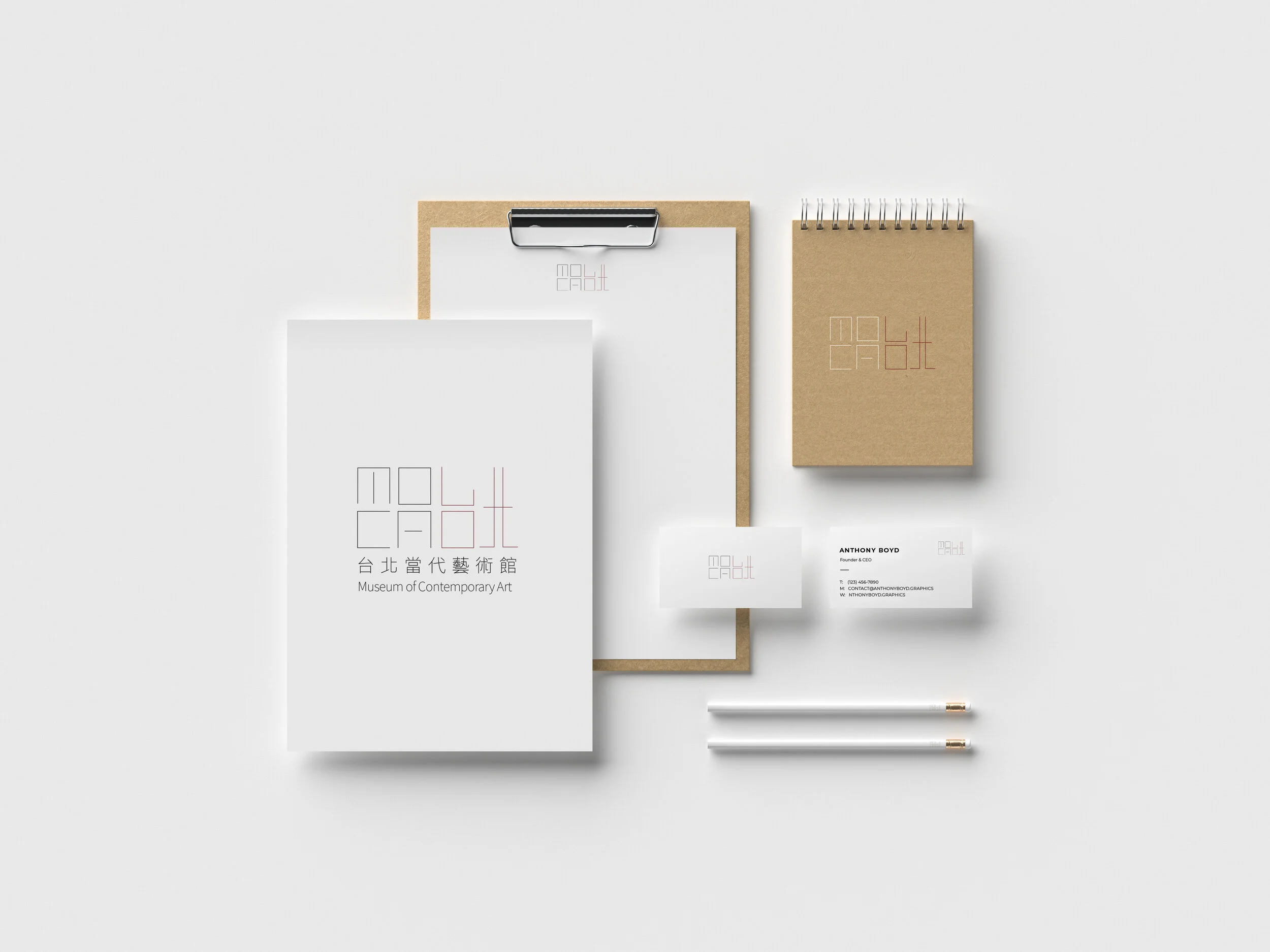
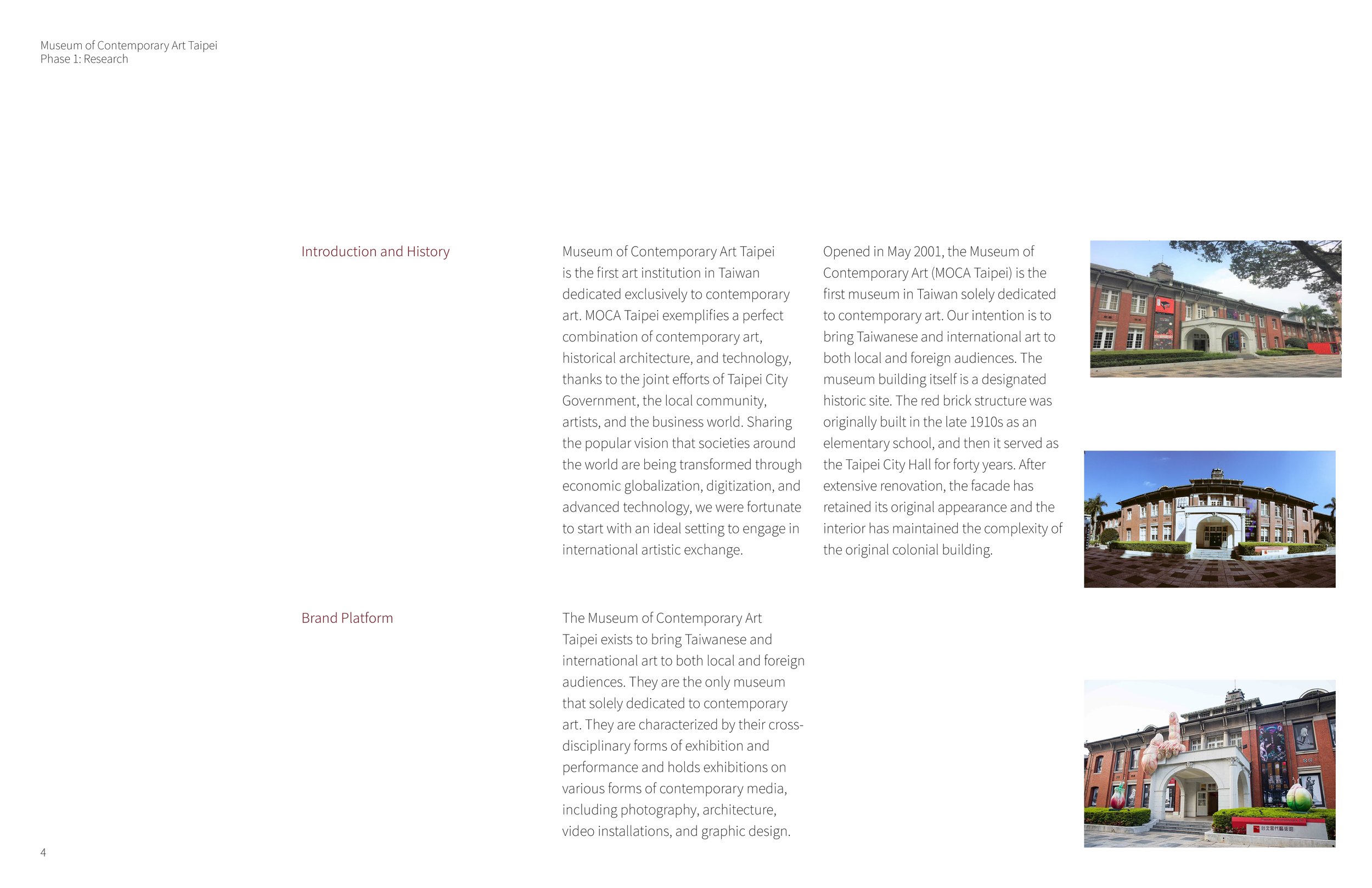
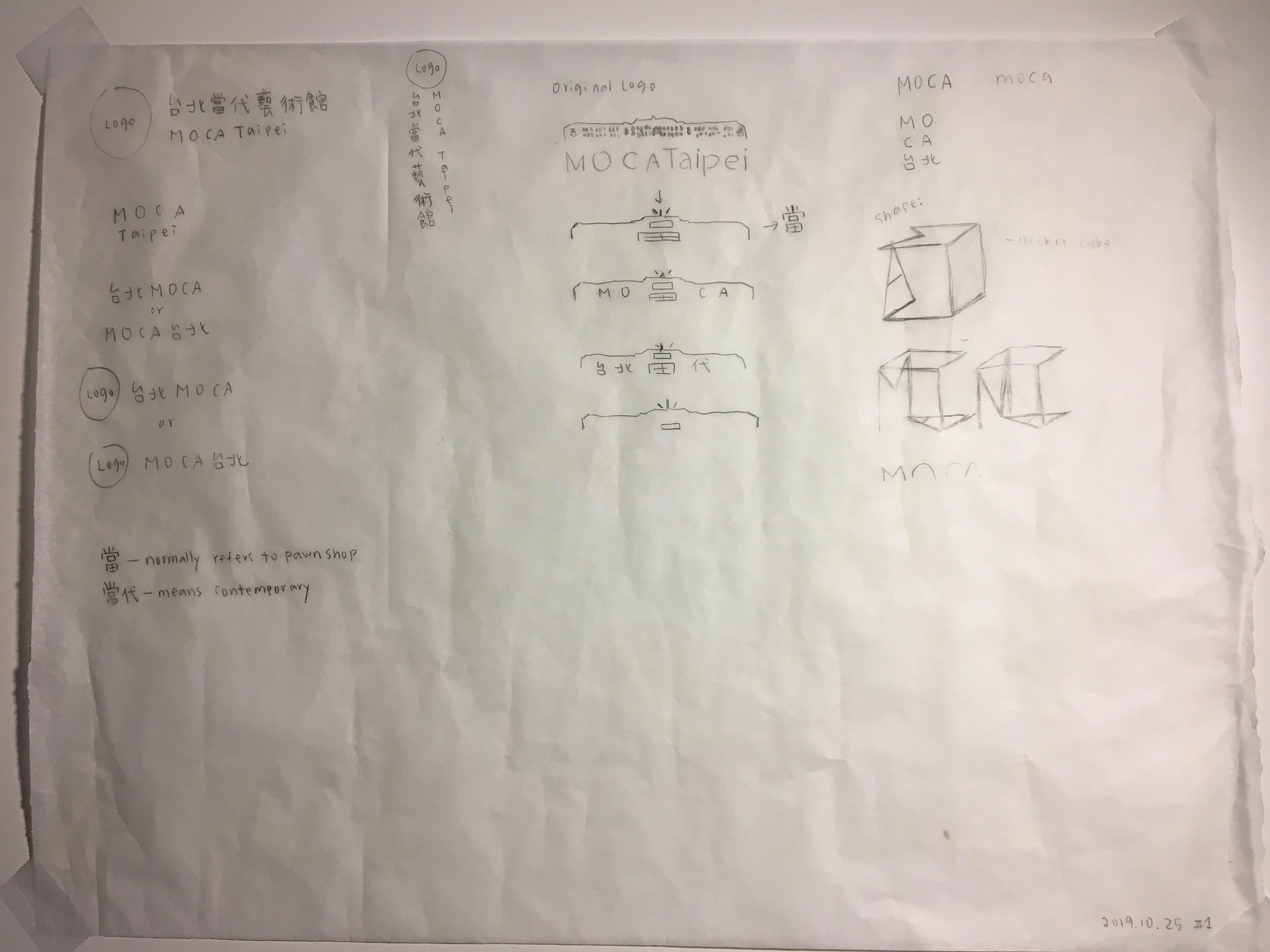
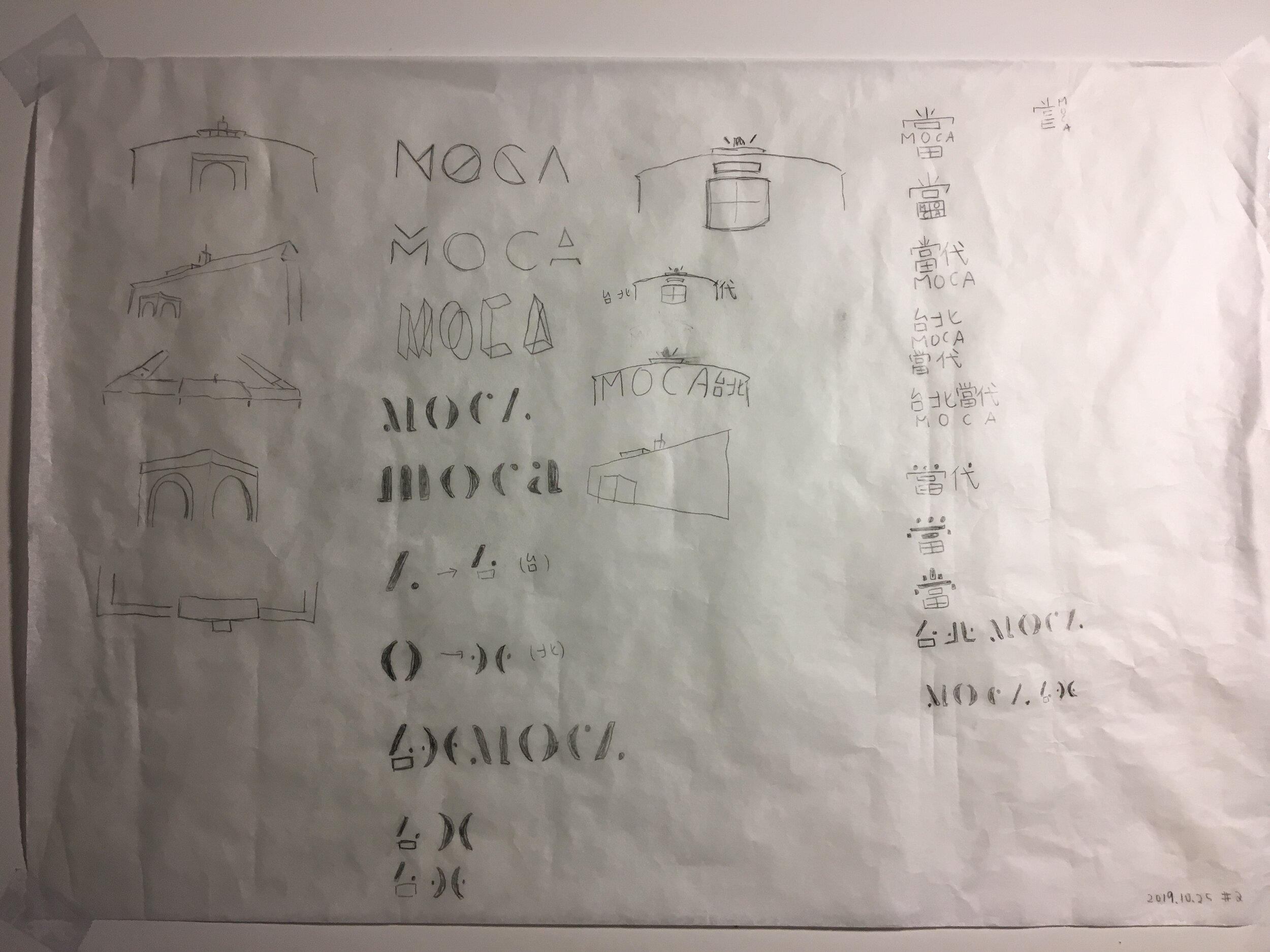
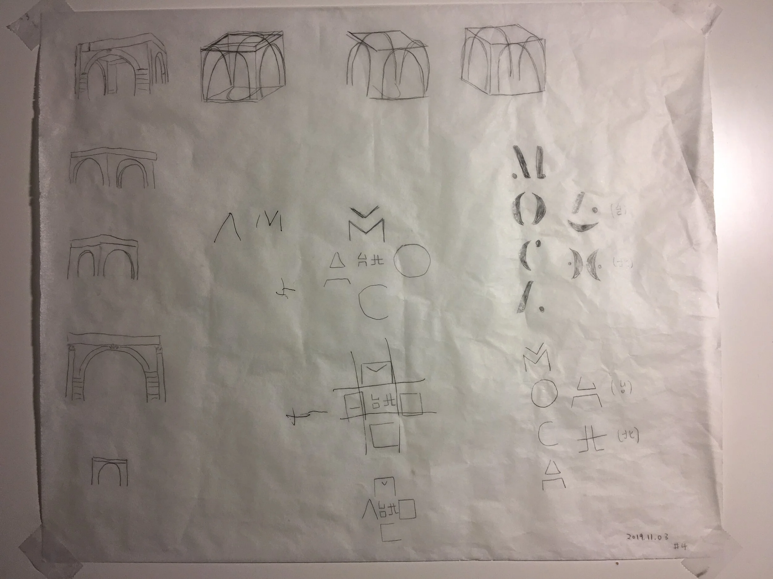
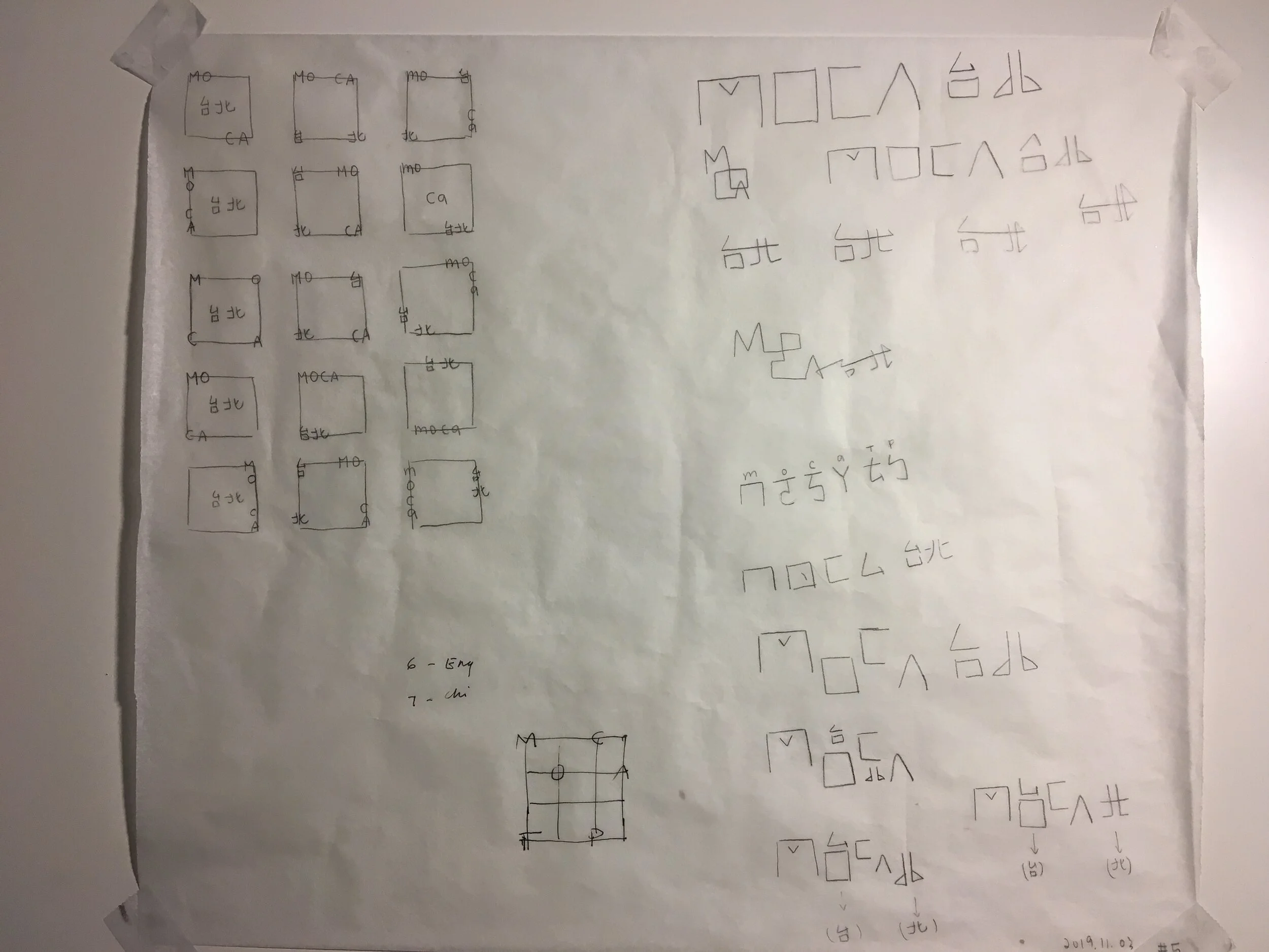
The objective for this project is to design a trademark and cohesive identity system for an existing organization. The organization I selected is the Museum of Contemporary Art Taipei. Throughout my research, I found out that the museum itself is in a historical architecture. This explains why the current logo has that specific building on it. The Museum of Contemporary Art Taipei exists to bring Taiwanese and international art to both local and foreign audiences.
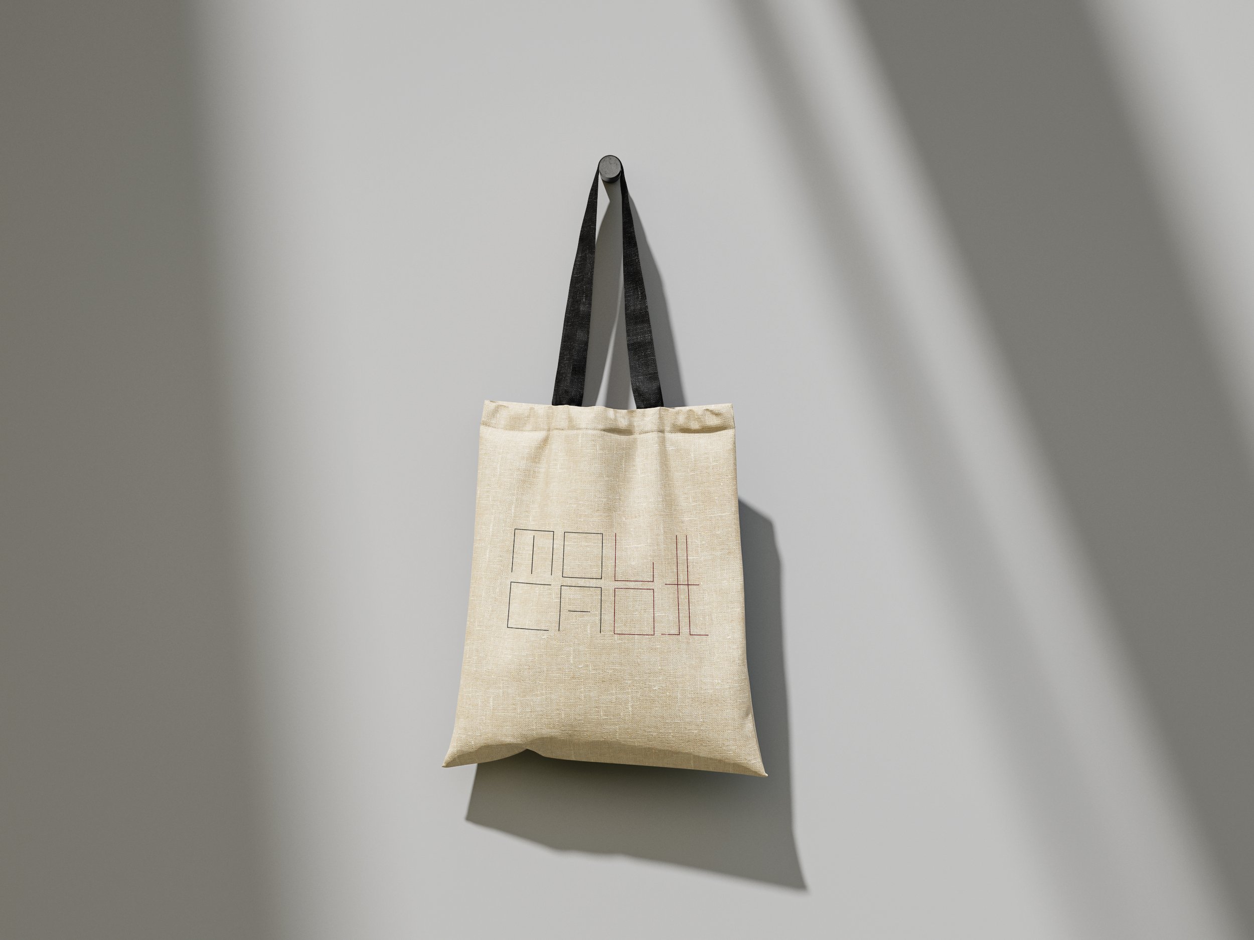
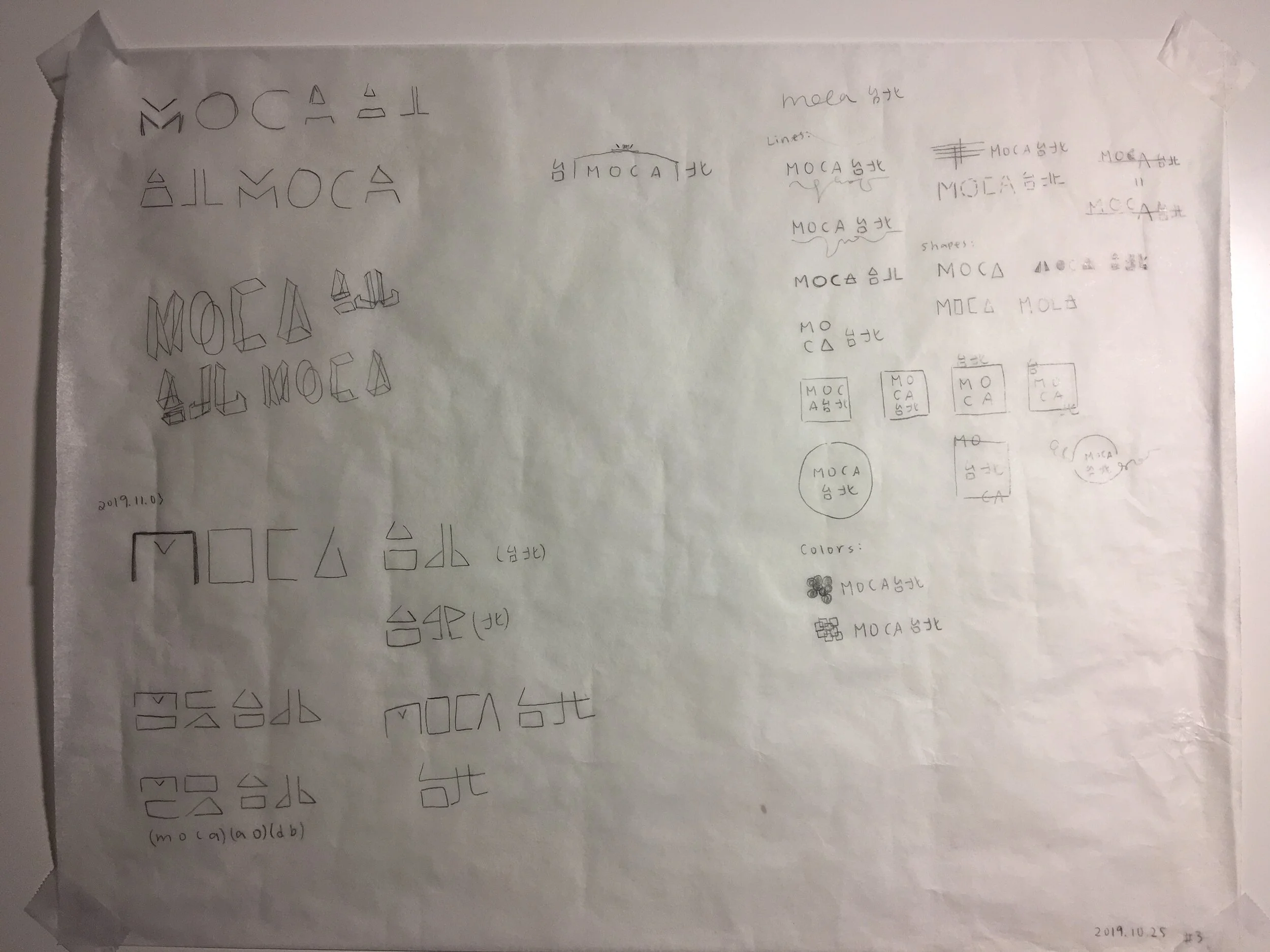
This became the foundation of my design idea. For this project, I design my own type with simple lines that makes two languages look alike, to show a sense of cohesiveness. I used brick-red for several reasons. First, this red can indicate the historical architecture. Second, the color red has many good meanings in Taiwan, so this little touch can make MOCA Taipei different from other MOCA around the world.